Using FairyGUI packages in your Projects
After importing FairyGUI packages into Studio, you must use them in the scene through scripting with FairyGUI API and Resource Manager API, just as you would with packages created using Studio's built-in UI editor.
Essential steps
To use imported FairyGUI packages:
Scripting interactive UI elements
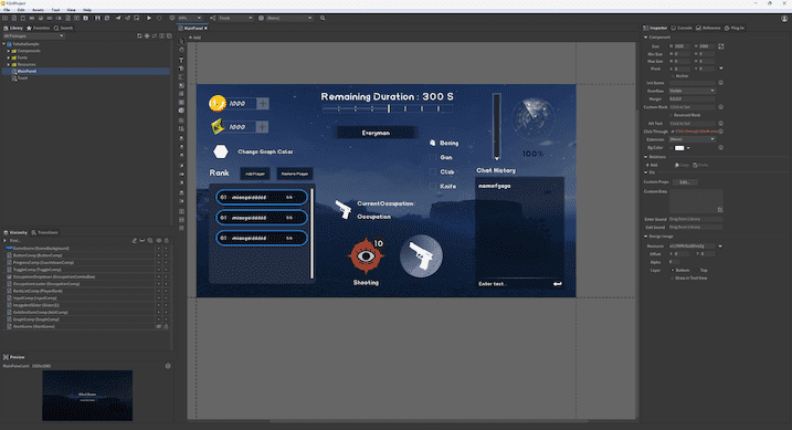
To help creators get familiar with scripting interactive UI elements from FairyGUI packages, we've provided a Sample FairyGUI package that you can use directly. Remember to compress the package into a ZIP file before importing it into Studio.
Transition
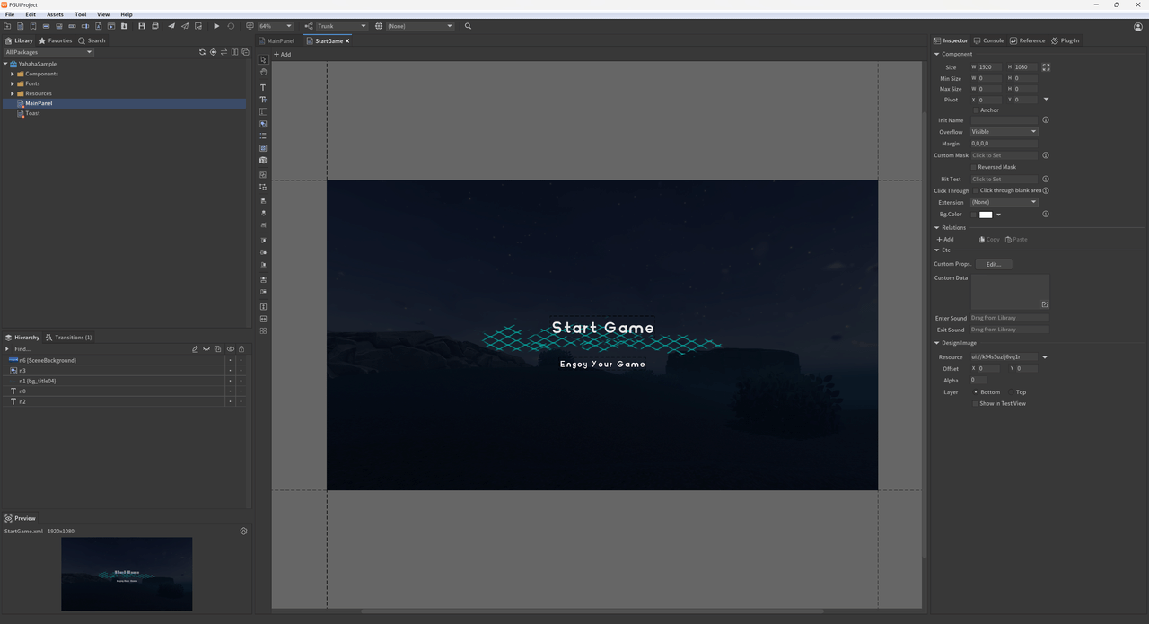
Get the "StartGame" panel and the "start" animation within. Play the animation and hide the panel once it finishes.
-- Transition: Play the opening animation
function ShowStartGame()
    -- Use GetChild method to access the "StartComp" component
    local startComp = mainPanel:GetChild("StartGame")

    -- Get the "start" animation from the "StartComp" component
    local startTransition = startComp:GetTransition("start")

    -- Define a function to hide the StartComp
    local function HideStartComp()
        startComp.visible = false  -- Set the visibility of StartComp to false
    end

    -- Play the startTransition and execute HideStartComp when the animation ends
    startTransition:Play(HideStartComp)
end
Text & Progress Bar
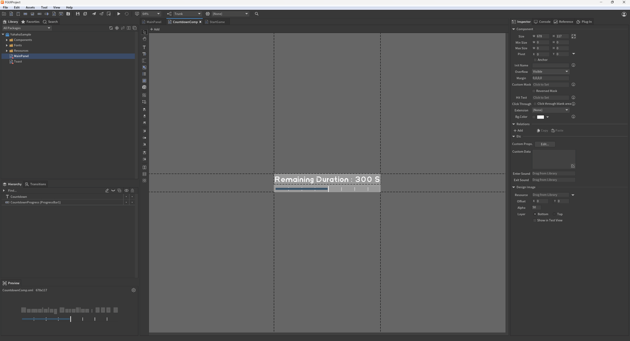
Update time information in the Update method to display a countdown timer and a progress bar.
-- Textfield and Progress functionality
local time=0
local totalTime=120--Set total duration for countdown timer
function CountDownText()
      if not mainPanel then
          return
      end

      time=time+0.02--Increment time based on frame duration of .02 seconds
      local countDownText=mainPanel:GetChildByPath("ProgressComp.Countdown")--Get countdown timer TextField by path
      countDownText.text="Remaining Duration : "..math.ceil(totalTime-time).." S"--Update countdown timer display with remaining duration

      local progress=mainPanel:GetChildByPath("ProgressComp.CountdownProgress")--Get Progress bar by path
      progress.value=((totalTime-time)/totalTime)*100--Calculate remaining time ratio based on total duration; update progress bar value
end

-- System's Update Method
script.OnUpdate(function ()
    -- Call the function to update the countdown text and progress
    CountDownText()
end)
Button
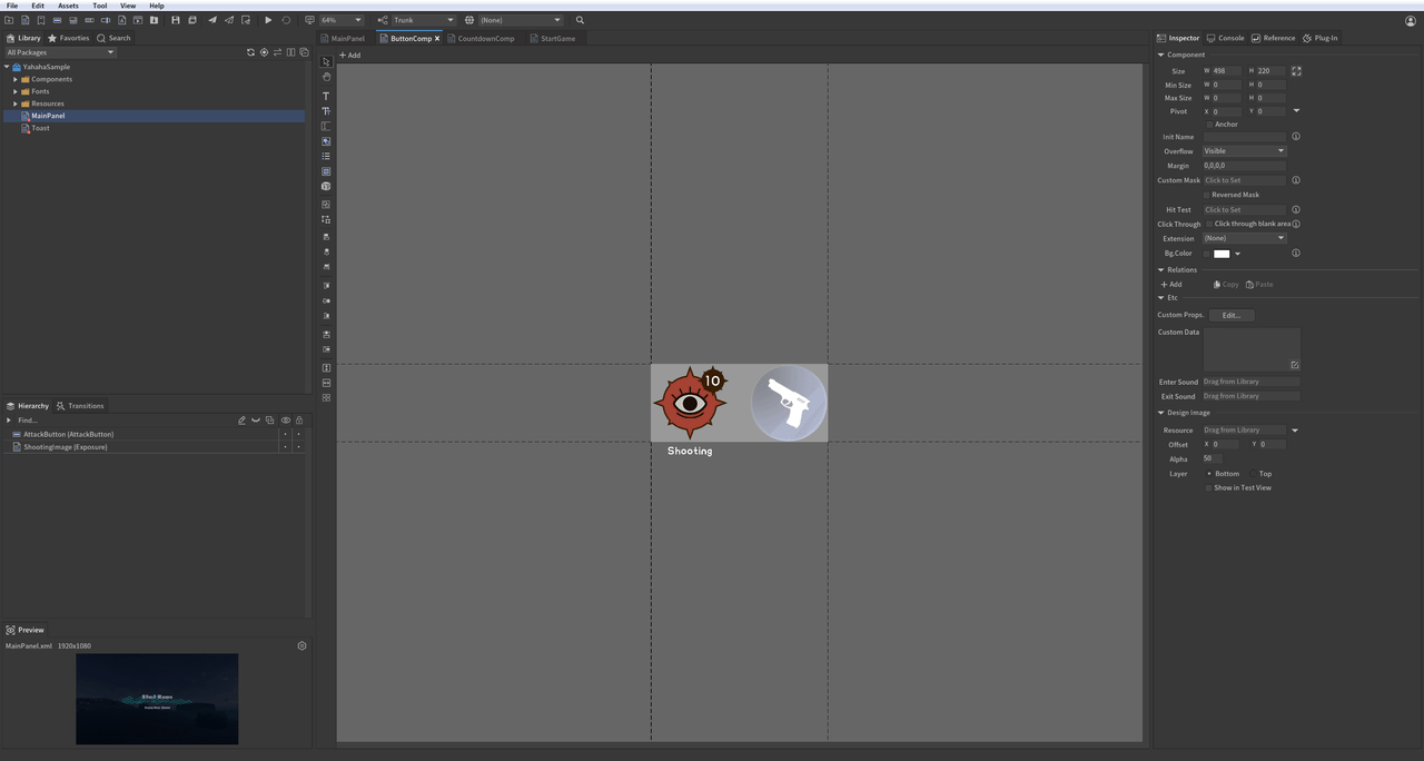
When the attack button is clicked, the number of bullets for shooting decreases. When the bullet count reaches zero, the attack button enters a cooldown period of 5 seconds.
-- Button and Controller functionality
local isShooting = true  -- Flag for shooting status.
local text  -- Variable for displaying remaining bullets text.
local shootingCountDown  -- Variable for countdown timer text field.
local BulletCount  -- Variable for bullet count tracking.
local controller1  -- Controller for shooting image state.
local controller2  -- Controller for attack button state.
function Shooting()
   local button = mainPanel:GetChildByPath("ButtonComp.AttackButton")  -- Get button by path.
   controller1 = mainPanel:GetChildByPath("ButtonComp.ShootingImage"):GetController("isShooting")  -- Get shooting image controller by path.
   controller2 = mainPanel:GetChildByPath("ButtonComp.AttackButton"):GetController("isShooting")  -- Get attack button controller by path.
   shootingCountDown = mainPanel:GetChildByPath("ButtonComp.AttackButton.ShootTimerText")  -- Get cooldown timer text field by path.
   text = mainPanel:GetChildByPath("ButtonComp.ShootingImage.RemainingBulletsText")  -- Get remaining bullets text field by path.

   BulletCount = 10  -- Initialize bullet count to 10.

   controller1.selectedIndex = 0  -- Set controller state to shooting (0). 0:shooting; 1:disabled.
   controller2.selectedIndex = 0

-- Event handler for the Shooting Button; reduces bullet count when the button is clicked
   local function ButtonOnClickEvent()
       print("The button is clicked on.")
       if not isShooting then
           return
       end

       BulletCount = BulletCount - 1  -- Decrease bullet count by one.
       text.text = tostring(BulletCount)  -- Update the TextField to display the remaining bullet count

       if BulletCount <= 0 then
           controller1.selectedIndex = 1   -- Change controller state to disabled (1) when bullets run out.
           controller2.selectedIndex = 1
           isShooting = false
       end
   end

   button.onClick:AddListener0(ButtonOnClickEvent)  -- Bind shooting button click event
end
List
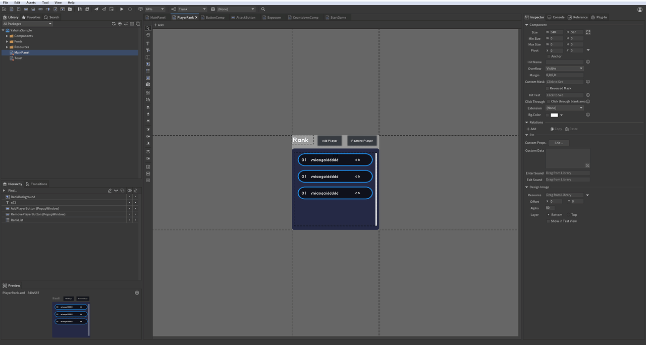
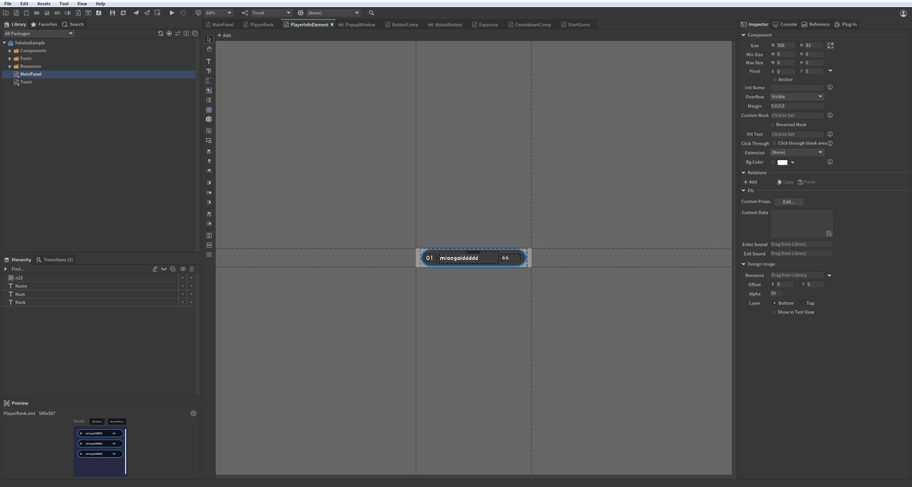
Create a player list that refreshes in real-time to reflect player data changes. Clicking "Add Player" increases the player count, while clicking "Remove Player" decreases it.
-- List: Create a player ranking list
function ShowRankList()
   -- Create player list data.
   local rankData = {}
   -- Get list by path.
   local list = mainPanel:GetChildByPath("RankListComp.RankList")
   -- Get Add Button.
   local addButton = mainPanel:GetChildByPath("RankListComp.AddPlayerButton")
   -- Get Remove Button.
   local removeButton = mainPanel:GetChildByPath("RankListComp.RemovePlayerButton")
   -- Refresh list data; set item count to 0.
   list.numItems = 0

   -- Method to add player information.
   local function AddButtonOnClickEvent()
       local length = rankData and #rankData or 1
       local newPlayer = {
           name = "hahaha_"..length,
           score = math.random(1, 100)
       }
       table.insert(rankData, newPlayer)
       table.sort(rankData, function (a, b)
           return a.score > b.score  -- Sort players by score in descending order.
       end)

       -- After updating player data, modify list's numItems to refresh it.
       list.numItems = #rankData
   end

   -- Bind Add button click event.
   addButton.onClick:AddListener0(AddButtonOnClickEvent)

   -- Method to remove player information.
   local function RemoveButtonOnClickEvent()
       if rankData and #rankData > 0 then
           table.remove(rankData, 1)  -- Remove first player in rankData.
       end

       list.numItems = #rankData  -- Refresh list after updating player data.
   end

   removeButton.onClick:AddListener0(RemoveButtonOnClickEvent)  -- Bind Remove button click event.

   -- OnRenderList will return each Item and its corresponding Index for user modification.
   local function OnRenderList(index, component)
       component:GetChild("Rank").text = tostring(index)  -- Set rank number based on index.
       component:GetChild("Name").text = rankData[index + 1].name  -- Set player name from rankData.
       component:GetChild("Num").text = tostring(rankData[index + 1].score)  -- Set player score from rankData.
   end

   list.itemRenderer = OnRenderList  -- Bind item rendering method to list.
end
Image & Slider
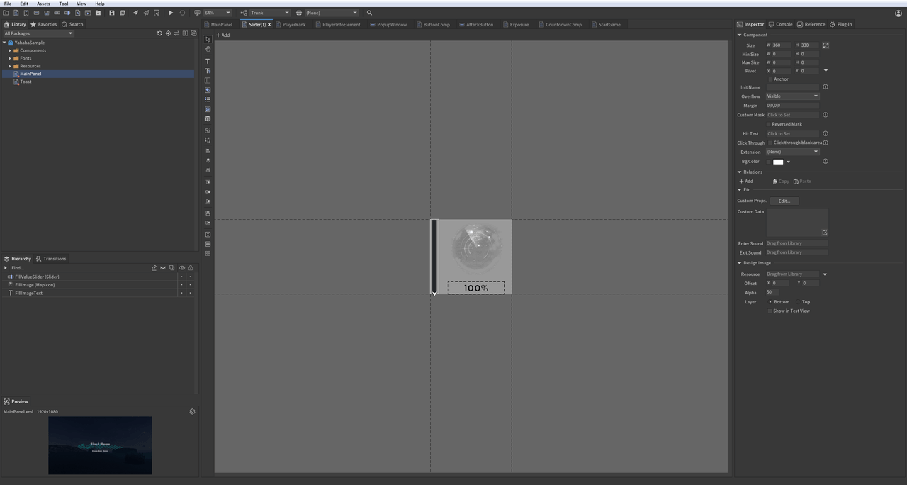
Dragging the slider changes the image's fill ratio and updates the percentage displayed.
-- Image: Modify image fill ratio
function ChangeMapImage()
    -- Use GetChildByPath method to get "FillImage" from "ImageAndSlider" component.
    local image = mainPanel:GetChildByPath("ImageAndSlider.FillImage")

    -- Get "FillValueSlider" from "ImageAndSlider" component.
    local slider = mainPanel:GetChildByPath("ImageAndSlider.FillValueSlider")

    -- Get "FillImageText" from "ImageAndSlider" component.
    local text = mainPanel:GetChildByPath("ImageAndSlider.FillImageText")

    local function OnSliderMoveEvent()
        -- Modify fill ratio value.
        image.fillAmount = slider.value / 100
        -- Update fill ratio text.
        text.text = math.ceil(slider.value).."%"
    end

   slider.onChanged:AddListener0(OnSliderMoveEvent)  -- Listen for slider drag events; update image fill value and text when dragged.
end
Graph
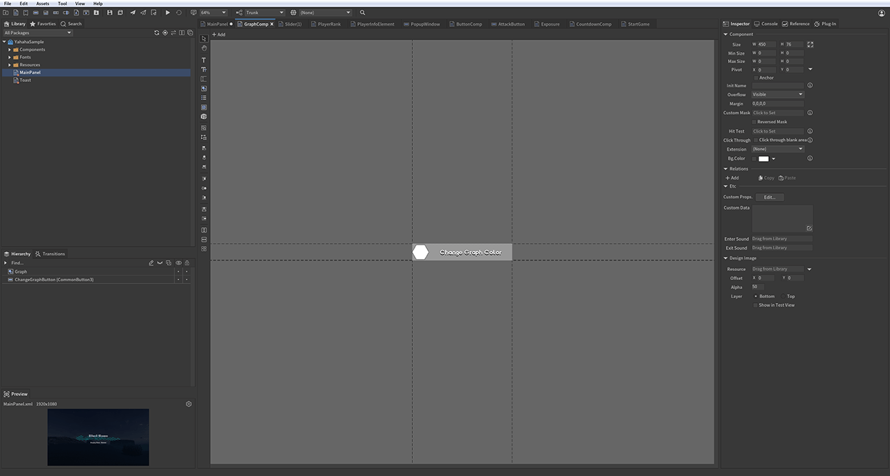
You can script an action when a user clicks the graph by connecting the graph to a ChangeColorButtonOnClickEvent event. For example, when you paste the following code for the graph, the graph changes to a random color every time a user clicks it.
-- Graph: Change graph color functionality
function ChangeGraphColor()
    local graph = mainPanel:GetChildByPath("GraphComp.Graph") -- Get the graph component

    local changeColorButton=mainPanel:GetChildByPath("GraphComp.ChangeGraphButton")--Get the button for changing color

    local function ChangeColorButtonOnClickEvent()
        -- Randomize RGB values for the graph color
        local randomValue1=math.random() -- Red value (R)
        local randomValue2=math.random() -- Green value (G)
        local randomValue3=math.random() -- Blue value (B)
        -- Set the graph's color using the random values with 50% transparency (Alpha)
        graph.color=UnityEngine.Color(randomValue1,randomValue2,randomValue3,0.5)

    changeColorButton.onClick:AddListener0(ChangeColorButtonOnClickEvent)--Bind click event to change graph color
end
ComboBox (DropDown) & Loader
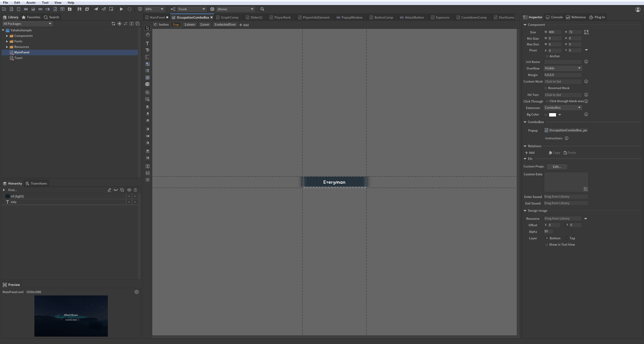
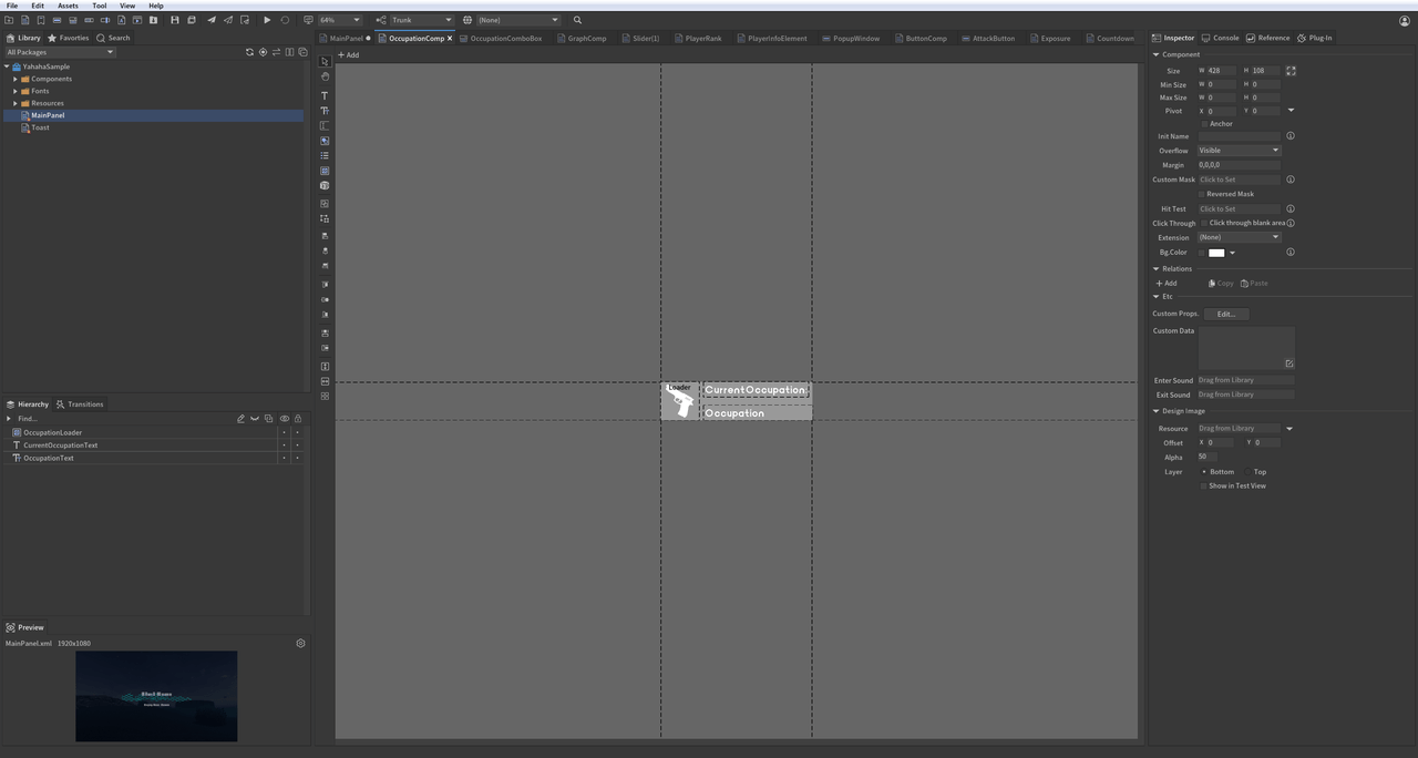
Select an option from the dropdown to change the corresponding image in the loader.
-- DropDown and Loader functionality
function DropDownAndLoader()
   -- Get the dropdown menu for selecting occupations
   local dropdown = mainPanel:GetChild("OccupationDropdown")
   -- Get the TextField to display selected occupation
   local occupationText = mainPanel:GetChildByPath("OccupationLoader.OccupationText")
   -- Get the loader to display corresponding images based on selection
   local loader = mainPanel:GetChildByPath("OccupationLoader.OccupationLoader")

-- Store image URLs corresponding to dropdown selections; change loader image based on selection change
local loaderIcons =
{
     [1] = "ui://k94s5uzlj6vq5",
     [2] = "ui://k94s5uzlj6vq7",
     [3] = "ui://k94s5uzlj6vql",
     [4] = "ui://k94s5uzlj6vqm"
}

-- Change loader image based on dropdown selection change event.
local function OnDropdownSelectedEvent()
     -- Update occupation text display based on selection
     occupationText.text = dropdown.text
     -- Update loader image based on selected index
     loader.url = loaderIcons[dropdown.selectedIndex + 1]
end

-- Bind the event listener to respond when the selected dropdown value changes
dropdown.onChanged:AddListener0(OnDropdownSelectedEvent)
TextInput
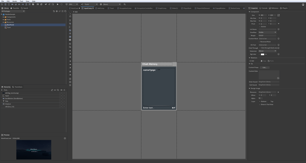
Create a text dialog box that enables users to input text and send messages.
-- InputField and RichText functionality
function ChatInput()
   -- Create a list to store chat messages
   local chatHistoryData = {}
   -- Get the field for user text input
   local textInput = mainPanel:GetChildByPath("InputComp.Input")
   -- Get the send button for submitting messages
   local sendButton = mainPanel:GetChildByPath("InputComp.SendButton")
   -- Get the chat list to display messages
   local chatList = mainPanel:GetChildByPath("InputComp.ChatList")

   -- Triggered when text is entered in the input field
   local function OnInputChangedEvent()
       print(">>> Input value is : "..textInput.text) -- Print current input value when changed.
   end
   textInput.onChanged:AddListener0(OnInputChangedEvent) -- Listen for input change events.

   -- Method to render each item in the chat list
   local function OnRenderChatList(index, component)
       component:GetChild("Text").text = "[color=#54FF13] ".. chatHistoryData[index + 1].." [/color]" -- Render chat messages with color using UBB syntax.
   end -- Use UBB syntax to set the color of the text in RichText format

   chatList.itemRenderer = OnRenderChatList -- Bind rendering method for chat list items.

   -- Send message and update the chat list UI
   local function SendButtonOnClickEvent()
       if textInput.text == "" then
           return
       end
       table.insert(chatHistoryData, textInput.text) -- Add input text to chat history data
       chatList.numItems = #chatHistoryData -- Update number of items in chat list based on history data length
       textInput.text = "" -- Clear input field after sending message.
   end

   sendButton.onClick:AddListener0(SendButtonOnClickEvent) -- When Send button is clicked, send message and update UI
   textInput.onSubmit:AddListener0(SendButtonOnClickEvent) -- When Enter key is pressed, send message and update UI as well
end
Prompts
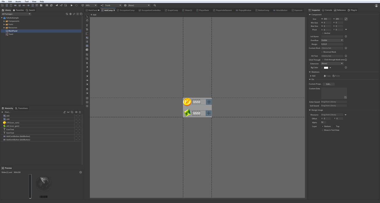
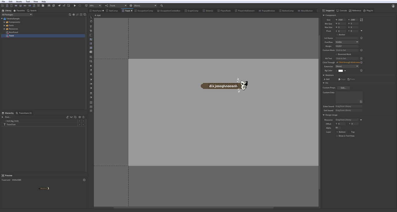
When clicking to add gold coins or gems, a toast message indicating "+1" is displayed.
- Create Sub Panel: Show Toast on button click functionality
function AddGoldOrGem()
    local function PlayTran(toastPanel)
        toastPanel:GetTransition("Enter"):Play(function ()--Play enter transition effect.
            toastPanel:GetTransition("Exit"):Play(function ()--Play exit transition effect after enter effect ends.
                toastPanel:Dispose()--Dispose of panel after exit transition ends.
            end)
        end)
    end

    local function CreateToastPanel() -- Method to Create Toast panel method
        local toastPanel=UIPackage.CreateObject(packageName,"Toast")
        mainPanel:AddChild(toastPanel)--Add Toast panel under main panel for display on screen.
        toastPanel.size=mainPanel.size--Set Toast panel size to match screen size.
        return toastPanel
    end

    local goldCount=0 -- Initialize gold coin count
    local gemCount=0  -- Initialize gem count

    local goldText=mainPanel:GetChildByPath("GoldAndGemComp.CoinText")
    goldText.text=tostring(goldCount) -- Display initial gold coin count
    local gemText=mainPanel:GetChildByPath("GoldAndGemComp.GemText")
    gemText.text=tostring(gemCount) -- Display initial gem count

    local addGoldButton=mainPanel:GetChildByPath("GoldAndGemComp.AddCoinButton")--Get button for adding gold coins
    -- Set event handler for adding gold; update remaining gold count and create Toast panel
    local function AddGoldButtonOnClickEvent()
        goldCount=goldCount+1
        goldText.text=tostring(goldCount)--Update remaining gold count display.

        local toastPanel=CreateToastPanel()--Create Toast panel instance.
        toastPanel:GetChild("ToastText").text="Gold Count + 1"--Set Toast message content.
        PlayTran(toastPanel)--Play Toast display effect.
     end

    addGoldButton.onClick:AddListener0(AddGoldButtonOnClickEvent)--Bind add gold coin button click event

    local addGemButton=mainPanel:GetChildByPath("GoldAndGemComp.AddGemButton")--Get add gem button by path.

      --Set add gem button click event to update gem count and create Toast panel.
      local function AddGemButtonOnClickEvent()
          gemCount=gemCount+1
          gemText.text=tostring(gemCount)--Update remaining gem count display.

          local toastPanel=CreateToastPanel()--Create Toast panel instance.
          toastPanel:GetChild("ToastText").text="Gem Count + 1"--Set Toast message content.
          PlayTran(toastPanel)--Play Toast display effect.
      end
      addGemButton.onClick:AddListener0(AddGemButtonOnClickEvent)--Bind add gem button click event.
end
Complete sample
Here's a video that demonstrates all UI effects in the sample package:
To view the complete code sample, click Code sample to download.
Common FGUI components and events
-- Component Type
local FGUIUIComponentType = {
    Component = "Component",
    Button = "Button",
    Graph = "Graph",
    Image = "Image",
    List = "List",
    Loader = "Loader",
    ProgressBar = "ProgressBar",
    Slider = "Slider",
    Text = "Text",
    TextInput = "TextInput",
    Dropdown = "Dropdown",
    Controller = "Controller",
    Transition = "Transition",
    RichText = "RichText"
}
-- EventListener Type
FGUIEventListenerType = {
    onClick = "onClick",
    onChanged = "onChanged",
    onRightClick = "onRightClick",
    onTouchBegin = "onTouchBegin",
    onTouchMove = "onTouchMove",
    onTouchEnd = "onTouchEnd",
    onDragStart = "onDragStart",
    onDragMove = "onDragMove",
    onDragEnd = "onDragEnd",
    onRollOut = "onRollOut",
    onRollOver = "onRollOver",
    onFocusIn = "onFocusIn",
    onFocusOut = "onFocusOut",
    onSizeChanged = "onSizeChanged",
    onSubmit = "onSubmit",
}